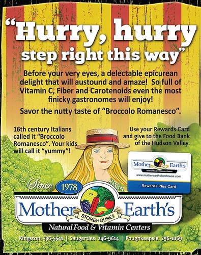
Ad design for Mother Earth’s Storehouse in Hudson Valley New York. A health food store in the Hudson Valley River region of New York, Mother Earth’s sells organic and locally produced products. Traditionally, they have been conservative and resistant to risk. On the contrary to previous ad agency, I tend to push the creative envelope. With print ads and ad designs, my creative emphasis is to grab the readers’ attention. Therefore it’s necessary to use full-color (if possible) and a bold headline. The proper use of color can detract or emphasize the focal point of the ad’s message.
In this case, I chose a carnival theme using a Coney Island styled message that a barker would use. Portraying Broccolo Romanesco as a strange though nutritious freak vegetable which teased readers to take a peek. The ad designed was very colorful using carnival reds, yellows and bright hues reminiscent of the traditional summer time spectacle.
Advertising design is not much different than the rhythmic shouts emanating from the skimmer hatted salesman. They both use rudimentary psychology to take advantage of the voyeuristic nature of the human being.

