Branding For Nonprofit Farm-To-Table Organization
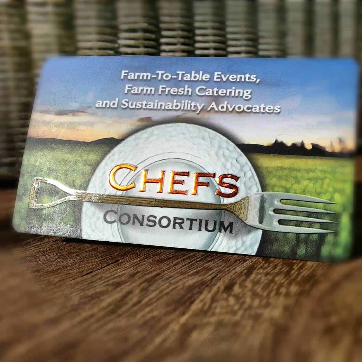
Branding For Nonprofit Organizations – Chefs Consortium Business Card Design
As a Nonprofit executive, you have the unenviable task of performing the impossible with little capital. With this in mind, Branding For Nonprofit Organizations should be of interest to you. As you may guess, everyone has a different definition of what “Branding” means. In this case, I created the organization’s name, logo, and design of all the supportive media, i.e. Website, Banner, Posters For Events, Facebook Ads, and some Public Relations.
Recognizable Branding For Nonprofit Organizations
There are literally millions of nonprofits registered in the U.S. alone. They include everything imaginable from Soup Kitchens, Universities, Medical Research, Clubs, Religious to Politics. “Charity” and its meaning have definitely evolved since Rev. George Whitefield found Bethesda orphanage in 1740. Let’s take a look at some very recognizable nonprofit brands. Below are the “10 Most Followed Charities” as featured in Charity Navigator:
Literal Or Lateral
To begin with, Farm-To-Table is the established mission of the Chefs Consortium. My objective is to portray their message of Farm-To-Table in an easily recognizable way. There are several strategies a graphic designer could take when starting the design process. They boil down to literal or lateral ways of approaching the logo design. I always try to “keep it simple” and it’s always good practice “thinking outside the box”. In this case, I chose to a literal approach which means incorporating some object that conveys the Chefs Consortium mission statement.
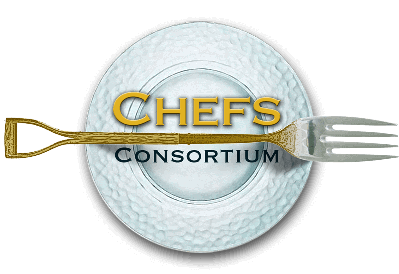
Final Logo Design for Albany Locavore Chefs
Lateral thinking is concerned not with playing with the existing pieces but with seeking to change those very pieces.
Collateral Design
Well, developed the nonprofit’s name and logo. Now, what’s next? The answer is getting the message out in different media and in many ways.
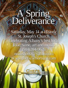
Poster Design for a nonprofit farm-to-table organization
Event Poster Design
One of the first events the Chefs Consortium announced was a celebration of locally-sourced food in a historic church in Albany, New York. With this in mind, the time of the event is Spring and what better way to represent a season of new life than with tulips.
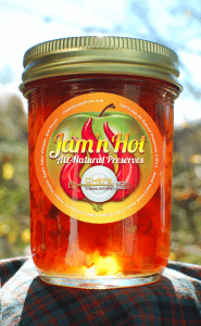
Label Design for Jam’n Hot All-Natural Preserves
Label Design
Farm-To-Table is typically a “slow food” process that includes handmade products. For that reason, Chefs Consortium wanted to try their hand starting their own food line. The result was the production of Jam’n Hot is pepper (hot) inspired jams.
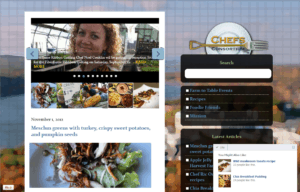
Chefs Consortium Website design
Website Design
In the same vein as “Keep It Simple”, I developed a responsive easy-to-navigate website design

